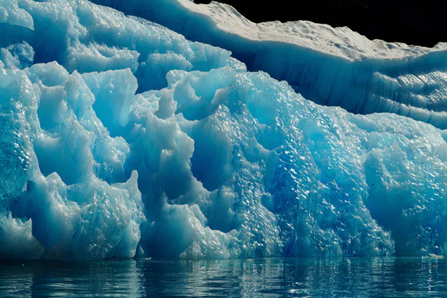
Every processed image ships a palette in its DTO — a handful of hexes lifted
from the photo itself. This page is not a table of hexes. It shows what each
helper is for, next to the photograph whose colours it used, and it publishes
the measured contrast ratio anywhere text sits on a palette colour.
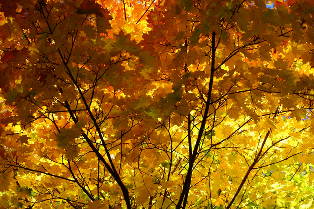
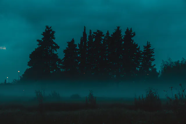
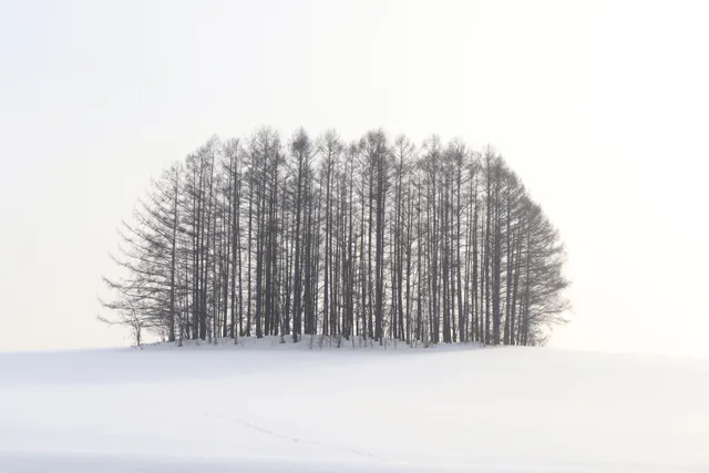
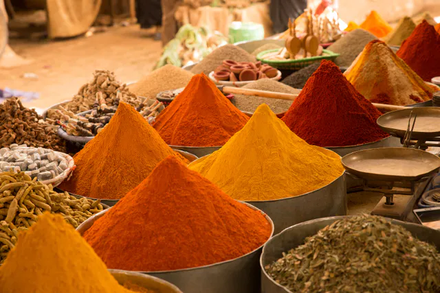
Nothing here is invented. Five photographs, uploaded to the public demo
tenant, each chosen for a different chromatic character — a palette page
where every photo is the same temperature teaches nothing:
photo
character
asset
autumn
warm / golden
731fa52c-2407-45dc-b3c2-1511a616a057
glacier
cool / blue
b86b250a-00f3-4576-9504-6d8a8b100af3
night
very dark
20c0a8a1-9da4-45bf-b043-17fedc006300
snow
very light
5ce5f6df-74b3-4945-9d38-0b1cb70295d0
spices
saturated
e7b53096-59a8-4909-8093-7e410b3c28f1
Their licences and photographers are at the bottom of this page.
Every palette below came back from the API; re-fetch any of them and check:
Terminal window
# your own runtime key and tenant code — see /start/credentials/
The ids above belong to the documentation tenant, so they will not resolve
under your key — upload one of your own photographs and read the palette off
the DTO it returns. The shape is identical.
The palette is deliberately tiny — one hex per swatch, and only the swatches
the source actually had. The long names map to 1–2 letter keys, because before
that the palette was 62 % of the asset DTO.
key
role
what it usually is
d
dominant
the colour the eye reads as “this photo’s colour” — always present
v
vibrant
the most saturated one — accents, never large surfaces
m
muted
desaturated mid-tone — the safest large surface
lv / lm
lightVibrant / lightMuted
the light end — page backgrounds
dv / dm
darkVibrant / darkMuted
the dark end — text, scrims, borders
population, the RGB array and the text colour are not shipped: they are
derivable in the client, and getTextColorForBackground computes the last one
on demand.
autumn — warm / golden. Six swatches, and dominant and darkVibrant are the same hex, #683600.glacier — cool / blue. Dominant #010102, which is the dark rock, not the ice. No lightVibrant at all.night — very dark. Only four swatches: no vibrant, no lightVibrant, no lightMuted. This is the photo that breaks a helper, below.snow — very light. Also four swatches, at the opposite end: dominant #FAFAF9 is all but white.spices — saturated. The only one of the five with all seven swatches.
A photo on #FFFFFF looks like a photo pasted onto a page. The same photo on a
surface borrowed from itself looks like it belongs there. That is the whole
job.
It prefers the light end — lightMuted → muted → lightVibrant → dominant —
because a vibrant surface fights the photo instead of holding it. Measured on
our five:
photo
ambient hex
role it came from
text it suggests
ratio
autumn
#C2AA48
muted (it has no lm)
#FFFFFF
2.30:1
glacier
#A7C2C6
lightMuted
#000000
11.18:1
night
#4C8D91
muted (it has no lm)
#FFFFFF
3.80:1
snow
#EAE9EB
lightMuted
#000000
17.35:1
spices
#E7C9C7
lightMuted
#000000
13.58:1
The two rows in bold are not typos and they are not hidden: the two photos with
no lightMuted fall through to muted, a mid-tone, and the suggested white
text lands at 2.30:1 and 3.80:1. Why that happens, and what to do about it, is
the limit below.
getAmbientGradient — the same idea with a direction
Text sitting on the gradient of spices. Black on the light end measures 13.58:1, and on the dark end 4.33:1 — the worst point on that surface is below the 4.5:1 body-text floor, so this text is only safe because it is large.
The helper answers one question: black or white on this hex? It computes WCAG
relative luminance and flips at 0.5.
photo
dominant
helper picks
ratio
the other option
verdict
autumn
#683600
#FFFFFF
9.92:1
#000000 2.12:1
correct
glacier
#010102
#FFFFFF
20.86:1
#000000 1.01:1
correct
night
#151818
#FFFFFF
17.86:1
#000000 1.18:1
correct
snow
#FAFAF9
#000000
20.11:1
#FFFFFF 1.04:1
correct
spices
#A93400
#FFFFFF
6.61:1
#000000 3.18:1
correct
On the dominant swatch the helper is right five times out of five — every
one of these photos has a dominant at one end of the range. It is the mid-tones
that break it. The clearest case is glacier’s muted, the pale ice blue:
What the helper returns
Glaciar Perito Moreno · 4 h de navegación. White on #97B5BA measures 2.18:1.
What measures better
Glaciar Perito Moreno · 4 h de navegación. Black on #97B5BA measures 9.63:1.
The limit: the helper flips at the wrong luminance
Black and white tie at relative luminance L ≈ 0.1791
(√(1.05 × 0.05) − 0.05), not at 0.5. Between 0.1791 and 0.5 the helper
answers white where black scores higher — and every mid-light saturated swatch
lands in that band. Across the five palettes on this page, 8 swatches fall
there:
photo
swatch
role
L
helper says
better
helper’s ratio
best ratio
autumn
#D8A705
vibrant
0.422
#FFFFFF
#000000
2.22:1
9.45:1
autumn
#C2AA48
muted
0.407
#FFFFFF
#000000
2.30:1
9.14:1
autumn
#837C3D
darkMuted
0.196
#FFFFFF
#000000
4.27:1
4.92:1
glacier
#379AB4
vibrant
0.272
#FFFFFF
#000000
3.26:1
6.44:1
glacier
#97B5BA
muted
0.432
#FFFFFF
#000000
2.18:1
9.63:1
night
#4C8D91
muted
0.226
#FFFFFF
#000000
3.80:1
5.53:1
snow
#A7AAB5
muted
0.403
#FFFFFF
#000000
2.32:1
9.06:1
spices
#D97501
vibrant
0.275
#FFFFFF
#000000
3.23:1
6.50:1
Every single one of the five photographs has at least one swatch in that
band, and in all eight cases the answer the helper gives is the worse of the
two.
The most common way a caption meets a photo is a translucent bar. And this is
where a measured ratio quietly becomes a fictional one: rgba(#5B4328, 0.72)
over a bright photo is not#5B4328, so measuring the nominal hex
overstates the contrast — by nearly 2× in the rows below.
Mercado de especias — white on the resolved bar measures 5.41:1 against this photo’s lightest swatch, not the 9.22:1 the nominal hex suggests.
photo
nominal scrim (dm)
resolved over its lightest swatch
white on nominal
white on resolved
autumn
#837C3D
#A59F51 over #FCFA85
4.27:1
2.74:1
glacier
#376877
#56818D over #A7C2C6
6.16:1
4.27:1
night
#151818
#151818 over #151818
17.86:1
17.86:1
snow
#57565A
#807F83 over #EAE9EB
7.28:1
3.98:1
spices
#5B4328
#87633E over #F9B777
9.22:1
5.41:1
autumn is the case worth staring at: the nominal 4.27:1 already looks
tight, and the resolved value is 2.74:1 — a caption nobody can read, over a
photograph everybody will like. Only spices and night clear AA once the
alpha is resolved; glacier and snow land in large-text-only territory.
night resolves to itself because its darkMuted and its dominant are the
same hex and it has no light swatch at all — there is nothing lighter in that
photo for the bar to sit on.
The backdrop used here is each photo’s own lightest swatch, i.e. the worst case
that image can offer.
For glacier the call returns exactly this — eight variables, no invention,
and note that --asset-light-vibrant is simply not there:
--asset-bg: #A7C2C6;
--asset-fg: #000000;
--asset-dominant: #010102;
--asset-vibrant: #379AB4;
--asset-muted: #97B5BA;
--asset-dark-vibrant: #044669;
--asset-light-muted: #A7C2C6;
--asset-dark-muted: #376877;
And rendered, using those variables and nothing else:
Glaciar Perito Moreno
Body text at 16px on –asset-bg, using –asset-fg: black on #A7C2C6 measures 11.18:1. The heading uses –asset-dark-vibrant — #044669 on the same background measures 5.36:1, which clears AA for body text.
USD 240 / persona
The same card, measured for all five — because a heading colour that works on
one photo is not a heading colour that works:
photo
ambient
body text (picked by ratio)
body ratio
heading (dv)
heading ratio
autumn
#C2AA48
#000000
9.14:1
#683600
4.32:1 — large text only
glacier
#A7C2C6
#000000
11.18:1
#044669
5.36:1 — passes AA
night
#4C8D91
#000000
5.53:1
#015B68
2.05:1 — fails
snow
#EAE9EB
#000000
17.35:1
#57565A
6.02:1 — passes AA
spices
#E7C9C7
#000000
13.58:1
#A93400
4.27:1 — large text only
darkVibrant as a heading colour is not dependable. On night the
ambient surface is itself a mid-tone teal and the “dark” vibrant is another
teal: 2.05:1, invisible. Two more land under 4.5:1. If the heading must be
legible, pick it by ratio like the body text.
Two gotchas worth knowing before you wire this up:
--asset-bg is the ambient pick, not the dominant. They are different
colours in all five of these photos. If you want the dominant, use
--asset-dominant.
The optional vars are absent, not empty, when the source had no such
swatch — glacier ships no --asset-light-vibrant, night ships neither that
nor --asset-vibrant nor --asset-light-muted. Always give var() a
fallback: var(--asset-vibrant, currentColor).
iteratePaletteSwatches — the strip for an admin UI
Display order, dominant first, missing swatches skipped. glacier, with what
each swatch can and cannot carry — every label below is drawn in the colour that
measures best, and the ratio printed is the one actually rendered:
dominant
#010102 · 20.86:1
vibrant
#379AB4 · 6.44:1 with black
darkVibrant
#044669 · 10.07:1
muted
#97B5BA · 9.63:1 with black
lightMuted
#A7C2C6 · 11.18:1
darkMuted
#376877 · 6.16:1
The vibrant and muted cards carry black text even though the helper
would have returned white for both — the same 0.5-threshold limit, on a real
palette. getTextColorForBackground would have put white on #97B5BA at
2.18:1.
Note also that a strip can contain the same hex twice: in night,
dominant and darkMuted are both #151818. Deduplicate before you draw a
strip, or a designer will report a rendering bug that is really just a dark
photograph.
getPaletteBlurBackground — a placeholder that costs zero extra bytes
The palette is already in the DTO, so this abstract “colour cloud” ships for
free — no LQIP to fetch, no base64 to inline. Four radial gradients anchored at
fixed corners over the dominant fill.
Placeholder · spices
The photo it stands in for
Placeholder · night (four swatches)
The third block is night, whose palette has four entries: three of the four
corners are simply not emitted, and the base fill shows through almost
everywhere. Missing swatches degrade a corner at a time — they never produce
undefined inside a CSS string.
Every number on this page is printed by a script that imports the real helpers
from @nitida/asset-client — none of them were estimated. Nothing about it is
privileged: it uploads the five photographs with an ordinary runtime key,
reads the palette back off each DTO, and computes every contrast ratio from
those hexes with the exported helpers. You can do the same on your own tenant:
Terminal window
exportNITIDA_KEY="…"# your runtime key — see /start/credentials/
exportNITIDA_TENANT_CODE="…"# your tenant code
The palettes are never retyped into this page — they are read from the JSON the
upload step wrote — so changing a helper and re-running is enough to tell
whether this page is still true.
For what these same photographs weigh at every width and quality, and for the
one place where asking for a quality costs you image quality, see
the transform benchmark.
All five are from Pexels under the
Pexels License, verified on 2026-08-17:
“All photos and videos on Pexels are free to use”, and “attribution is not
required”. We credit anyway — it costs a line.